YouTube's seed deck
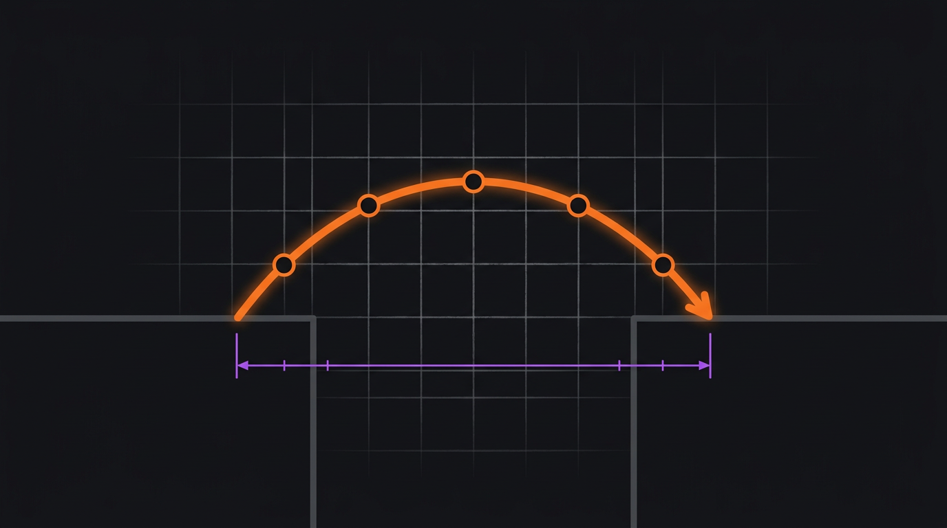
YouTube's ten-slide deck to Sequoia is plain, text-heavy, and visually unremarkable, and it's a clean Bridge. It names a specific technical gap (video files were too large to share and there was nowhere to put them), then presents the product as the mechanism that closes it. No movement, no manifesto. It's the strongest evidence in this series that pattern discipline beats production value.
Ten monotone slides, later surfaced through legal proceedings, that preceded a $3.5M round from Sequoia. Every design-focused deck roundup uses this one as the ugly-duckling example. The interesting reading isn't that ugly decks can win: it's what the deck got structurally right while getting everything visual wrong.
Read the actual deck
- YouTube seed-stage pitch deck, Alexander Jarvis
- The original deck that helped YouTube raise $3.5M, Tubefilter
Deck facts come from these sources. The pattern diagnosis below is DeckShift's reading: an argument about structure, not a claim about what the founders intended.
The arc, beat by beat
What the deck does, and which beat of the pattern it's playing.
- Beat 01Lands
Identifies the gap directly: video files were too large to email or host, and no consumer-grade way existed to share them.
Act I and the start of Act II compressed. The current state is named as a specific technical impossibility, not a vague frustration.
- Beat 02Lands
Frames the opportunity as a white space: a category of content with nowhere to live.
Act II, the chasm. The measurement is structural rather than numeric: the gap is proven by the absence of any alternative.
- Beat 03Lands
Presents the product as conversion plus serving: take the unshareable file, make it playable anywhere.
Act III, the span, described as a mechanism rather than a vision.
- Beat 04Strains
Covers market and growth expectations in plain text with minimal supporting evidence.
Thin. A Bridge closes on what changes and by how much; this deck largely leaves that to the reader.
- Beat 05Strains
Makes no attempt at a narrative frame for how media consumption might change.
An Epic Tale was sitting right there, unclaimed. The shift was real and the deck didn't reach for it.
Why it works
The gap was airtight. In 2005 there was genuinely nowhere to put a video, and that absence is a form of measurement no chart improves on: you cannot argue with a category that doesn't exist. The deck's plainness is almost incidental; what carried it was that the problem statement admitted no counter-argument, and the solution mapped onto it exactly.
Where it strains: It left the bigger pattern on the table
Read now, the deck is conspicuously small about what it was describing. The shift in how the world would consume media was arguably the most consequential of the decade, and this deck treats it as a file-format problem. That's not a criticism of the outcome (a tight Bridge closed the round), but it's a reminder that choosing the smaller pattern costs you the larger framing, and with it the ability to create budget, category, or urgency beyond the immediate gap.
It's an investor deck. Does the read transfer?
Investor deck, but the choice it illustrates is a daily sales decision: when a real shift sits behind your product, you can pitch the gap or pitch the shift. The gap closes the deal in front of you; the shift changes what the buyer thinks they're buying.
What to take from it
A tight Bridge will win a room on substance alone, whatever the deck looks like. But check what you're leaving unclaimed: if there's a genuine shift behind your gap, someone is going to narrate it, and it may as well be you.